Monday, January 28, 2008

x o x o x o x o x o x o x o x o x o x o x o x o x o x o x o


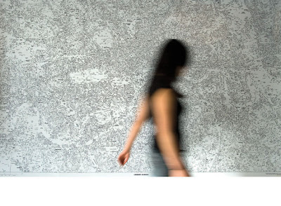
With Valentine's Day around the corner, I thought it would be nice to consider some love letters. Traditionally, the X and the O come to mind, although I don't know the historic significance of these. The example above is one from my own archives which I made last year for my husband, Paul. Then there is this alternative love letter, which is a paper cut artwork if you can believe, by Oakland CA artist, Annie Vought. I originally assumed this was wire, but come to find out it and other amazing works of hers are cut paper. Brings to mind some of the Japanese and Chinese paper artists, but a contemporary take on this technique.

Thursday, January 24, 2008

Bird on a Wire Font


Poster design by British designer, Daryl Waller.

ABC's of Design


Alphabet designed by illustrator, Leigh Wells. The initial caps open each chapter of an encyclopedia of interior design for Fairchild Publishers.

Handmade Letterforms of Eduardo Recife


Brazilian designer, Eduardo Recife manages the site Misprinted Type. Check out his illustration portfolio of great work and download some free fonts while you are there. Lots of other good stuff here too.

Tuesday, January 22, 2008

Alphabet Exhibit

Focusing on an ordinary subject that we see each day, often by the hundreds of thousands, Alphabet presents 26 letters as more than just shapes for conveying information. The 51 artists and designers in this show conceive and interpret the alphabet in surprising and inventive ways, ranging from graceful and polished to witty and unconventional. The 63 alphabets featured in Alphabet were created by artists in North America, Europe, and Asia, and represent work from well-known typographers and designers as well as rising artists and design students. It is scheduled to open in July 2008 at the Art Institute of Portland in Oregon. http://www.artinstitutes.edu/portland/

Monday, January 21, 2008

Type Pattern by Job Wouters


Print design for Tommy Hilfiger Denim by Dutch designer, Job Wouters.
Typographical wildstyle with the letters T, H and D. None of the elements are copied; all shapes are unique.

Ray Fenwick Typographic Patterns


Check out the rest of his amazing work on his website. He loves making patterns and his hand lettering and illustration style is just delightful. Plus, he has a great sense of humor about his work. Very refreshing!
http://rayfenwick.ca/

Pattern Design and Typographic Expression

We're turning over a new page this week and exploring letterforms and typographic patterns. By definition, pattern results from the repetition of an element or motif. How the elements are distributed, and the relative scale and detail of these elements, determine the complexity of a given pattern. Complexity, however is no guarantee of a successful pattern design. Nor is a regular pattern eminently more satisfying than an abstract pattern. Regular patterns are more structured and often based on mathematical measures whereas Irregular pattern design is freeform and has an element of surprise. Within the realm of pattern design, both of these structures are indispensible.

Paula Scher's Tsunami Map


Paula Scher's map, "Tsunami", acrylic on canvas, 2006. 113.5 x 92 in.

“These are absolutely, one hundred percent inaccurate,” Paula Scher declares of her colossal map paintings. Then, after a pause: “But not on purpose.” Another pause: they’re actually “sort of right.” And therein lies their bracing paradox. Scher’s sites—Manhattan, Israel, and India among them—are instantly recognizable. Scanning the allover expanse of the canvases, you might easily pick out the swath of Central Park, the void of the Dead Sea, the dot of Mumbai. But they are also highly interpretive. She makes them with brush and paint, rather than keyboard and printer. Most importantly, she makes them in rebellion against what she calls the excess of “useless information” in the information age. The profusion of text—words spilling off landmasses and jutting or swirling out to sea—recalls the cacophonous crawls of a cable news broadcast. Tsunami suggests its subject compositionally, its texts running in a radiating circle around the eye of the ruinous wave.

Sunday, January 20, 2008

Influence Map of Marian Bantjes


This is a link to a map Canadian type and lettering artist, Marian Bantjes made in August of 2006 to show all of her significant artistic influences to date. While you are at it, you may want to check out the rest of Marian's site to see all of her amazing typographical works. She is indeed prolific and has a lot to say about design, typography and inspiration.

Friday, January 18, 2008

South London Arteries


By British artist Susan Stockwell, 2002

Map Circle


Constructions with map pieces, by Chris Kenny, 2007

Thursday, January 17, 2008

Adventures in Map Making

Maps convey information and tell stories. They invite discovery, exploration and surprise. And they provide a method to navigate your way through unfamiliar territories. Creative problem solving can be a voyage into the unknown where you travel without a map in uncharted waters. And beginning any new artistic endeavor is not without risk, as you venture off this grid to test the waters, but the rewards can be great. Making maps of these new territories are their own best adventures. Bon Voyage!

“A road map always tells you everything except how to refold it”.
- Anonymous

Typewriter Map Symbols

Manhattan Neighborhood Map

London Calling


London's Kerning poster designed for the ISTD exhibition "My London/My City" by NB:Studio in London.

Paris Map


Map by artist Juliette Borda.

You Are Here


This letterpress-printed map published by artist Julie Chen of Flying Fish Press in California, unfolds in a circular manner as if it were a trail you might be following. It is enclosed in a self-contained box with a plexiglas lid and a small toy compass embedded.