Monday, February 25, 2008

Self Study Course in Good Penmanship


The Ames Guide to Self-Instruction in Practical and Artistic Penmanship is posted at link above in its entirety by the International Association of Master Penman, Engrossers and Teachers of Handwriting (IAMPETH). Check out the "artwork" and "lessons" links for other great posts on their home site: http://www.iampeth.com/

Penmanship


Here are some wonderful examples of script lettering by Maybelle Imasa-Stukuls. I will post others in days to come.

Really Big Street Art


This next Sunday, March 2nd, King's Books in Tacoma will be hosting a printer's Wayzgoose in honor of Small Press Month. A Wayzgoose was the traditional name for a late Summer celebration hosted by a master printer for his press workmen. Today, the "harvest goose feast" has given way to regional gatherings of letterpress and book artists as an opportunity to promote the printing arts and their work. On Sunday, organizers are bringing in a large steamroller to make large 3 x 4' wood and linocuts in the street at King's Books. Hey, if it's big and can apply pressure to a flat surface, it's printmaking. I guess it was just cheaper to rent a steamroller than it was an elephant. Come see this free event and meet a lot of these Puget Sound area letterpress printers and book artists at King's Books, from noon to 4pm, March 2nd. 218 St. Helen's Ave. in Tacoma. View link above and here for more information. http://www.exit133.com/2873/exit133-video-steamroller-printing

Monday, February 18, 2008

Steal This Art


I stole these works of Art Chantry's off the Gig poster site linked above. There are over 200-some posters there for sale. Chantry is the bad-boy of design and one of the most prolific artists I know. He is a master manipulator of type and images sourced from various, cheesy old magazines, newspapers and other found bits and pieces of ephemera - a genre many others have tried to duplicate, but none nearly so gritty OR witty. And to think, he does most all of it with sharp blades and the magic of photocopiers. Precisely what all of you will be doing this week when Art so gracioulsly hosts a cut-and-paste workshop with us. So bring your best junk and sharpest blades and come prepared to play!

Incredible Shrinking Design


Have you ever picked up an old book and noticed a beautiful little book trade label pasted down to the endpaper? Bookbinders, printers, publishers, and sellers of books used to advertise their trades this way. Such labels have been used in books in Europe, Canada and the US since the 1700's. Although they were often no larger than a quarter in most cases, the skilled level of design and typography displayed was no less deserving. Much of it designed entirely by hand, often with flourishes and decorative borders, and some of the most beautiful had text set inside the frame of a book. Many were printed by rubber stamps, but most often they were printed by trade letterpress printers. They were usually one or two colors, often with a reverse on color papers to give the impression of two-color printing. And I find the endless variety of die-cut and embossed labels to be intriguing examples of printing history and skill. Greg Kindall, of nearby Kirkland, WA has displayed a collection of over 2100 book trade labels at his website, sevenroads.org where you can explore them by geographical region, topical or alphabetical order. A librarian's dream. You can click on image for closer examination, or explore far more at Kindall's website.

Friday, February 15, 2008

Gorgeous Specimens


Now you can have sweet dreams of U's...and P's and Q's and all other letters of L'Alphabet.

To Do


Street art found somewhere on a wall in Soho.

Sunday, February 10, 2008

Post-it Wide


Sanda Zahirovic, a student at Kingston University in London created her own font out of post-it notes.

Ohio Art


It's the virtual Etch-a-Sketch! Fun for the whole family (If there is such a thing).

Tuesday, February 5, 2008

You Break it, You Own it


This is a bit of a diversion from the normal track of posts here, but check out the link above to HEMA, a Dutch department store. It was first opened in 1926 in Amsterdam. It's sort of the Woolworth's of Holland, but with a sense of humor. This attempt at corporate humor (an oxymoron) isn't really functional, but memorable much the same. Take that Wal Mart!

Paper Alphabet


San Francisco Bay artist, Sara Newman recently completed a remarkable series of 26 handcut paper letters - one for each letter of the alphabet. Her intricate paper cuts mimic some of the ornate initial caps seen in fine press books and translate so beautifully to the cut paper process. It is quite impressive to see the immense variety of ornamentation upon close examination of her work.

Cut Paper Work of Robert Ryan


More colors do not necessarily mean greater artwork. Take the work of British artist, Robert Ryan who does elaborate paper cuts and screenprints. Some of his best work is entirely one color. In fact I think his work suffers when he uses more than one color as the strength of it is the silouetted design work. Ryan has received great recognition for developing a specialized trademark style. He is a designer and an illustrator combined - and he understands how to playfully integrate text into his works. He has received acclaim for this paper cut style and continues doing book and magazine illustration, fashion, window display and even product design.

Monday, February 4, 2008

V is for Vmail


The Philatelic Alphabet, was the name of a show featuring an alphabet of stamp designs produced as a project of the AIGA/San Francisco in 1997. The special stamp images that accompany the A to Z definitions were created by designers at 26 San Francisco Bay Area studios. Dickson Printers in Atlanta, later published a boxed version of the 26 alphabet stamps along with stamp-collecting tools nestled in boxes and a beautifully designed book describing the stamp definitions. You can learn more about the individual stamps from this project (in addition to all-things-stamps) at this site: http://alphabetilately.com/credits.html

Coming to a Post Office Near You, Summer 2008


In recognition of their groundbreaking contributions to architecture, furniture design, manufacturing and photographic arts, designers Charles and Ray Eames will be honored by the USPS this summer with a pane of 16 stamps designed by Derry Noyes of Washington, DC. If you’ve ever sat in a stackable molded chair, you’ve experienced their creativity. Perhaps best known for their furniture, the Eameses were husband and wife as well as design partners. Their extraordinary body of creative work — which reflected the nation’s youthful and inventive outlook after World War II — also included architecture, films and exhibits. Without abandoning tradition, Charles and Ray Eames used new materials and technology to create high-quality products that addressed everyday problems and made modern design available to the American public.

More Posts on Postage Stamps


I think these works by French designer and illustrator, Emmanuel Polanco, would make lovely postage stamps. Letters are far more fun to send when you can display a beautiful stamp on the envelope as a crowning touch. Polanco's illustration work is very provocative and multi-layered. And his typographical elements for the most part, are somewhat spare, yet beautifully applied. Click on the link above to visit his website. You can also explore more of his fine artwork at the Graphic Exchange website: http://www.graphic-exchange.com/exellence/emmanuelpolanco.htm

Monday, January 28, 2008

x o x o x o x o x o x o x o x o x o x o x o x o x o x o x o


With Valentine's Day around the corner, I thought it would be nice to consider some love letters. Traditionally, the X and the O come to mind, although I don't know the historic significance of these. The example above is one from my own archives which I made last year for my husband, Paul. Then there is this alternative love letter, which is a paper cut artwork if you can believe, by Oakland CA artist, Annie Vought. I originally assumed this was wire, but come to find out it and other amazing works of hers are cut paper. Brings to mind some of the Japanese and Chinese paper artists, but a contemporary take on this technique.

Thursday, January 24, 2008

Bird on a Wire Font


Poster design by British designer, Daryl Waller.

ABC's of Design


Alphabet designed by illustrator, Leigh Wells. The initial caps open each chapter of an encyclopedia of interior design for Fairchild Publishers.

Handmade Letterforms of Eduardo Recife


Brazilian designer, Eduardo Recife manages the site Misprinted Type. Check out his illustration portfolio of great work and download some free fonts while you are there. Lots of other good stuff here too.

Tuesday, January 22, 2008

Alphabet Exhibit

Focusing on an ordinary subject that we see each day, often by the hundreds of thousands, Alphabet presents 26 letters as more than just shapes for conveying information. The 51 artists and designers in this show conceive and interpret the alphabet in surprising and inventive ways, ranging from graceful and polished to witty and unconventional. The 63 alphabets featured in Alphabet were created by artists in North America, Europe, and Asia, and represent work from well-known typographers and designers as well as rising artists and design students. It is scheduled to open in July 2008 at the Art Institute of Portland in Oregon. http://www.artinstitutes.edu/portland/

Monday, January 21, 2008

Type Pattern by Job Wouters


Print design for Tommy Hilfiger Denim by Dutch designer, Job Wouters.
Typographical wildstyle with the letters T, H and D. None of the elements are copied; all shapes are unique.

Ray Fenwick Typographic Patterns


Check out the rest of his amazing work on his website. He loves making patterns and his hand lettering and illustration style is just delightful. Plus, he has a great sense of humor about his work. Very refreshing!
http://rayfenwick.ca/

Pattern Design and Typographic Expression

We're turning over a new page this week and exploring letterforms and typographic patterns. By definition, pattern results from the repetition of an element or motif. How the elements are distributed, and the relative scale and detail of these elements, determine the complexity of a given pattern. Complexity, however is no guarantee of a successful pattern design. Nor is a regular pattern eminently more satisfying than an abstract pattern. Regular patterns are more structured and often based on mathematical measures whereas Irregular pattern design is freeform and has an element of surprise. Within the realm of pattern design, both of these structures are indispensible.

Paula Scher's Tsunami Map


Paula Scher's map, "Tsunami", acrylic on canvas, 2006. 113.5 x 92 in.

“These are absolutely, one hundred percent inaccurate,” Paula Scher declares of her colossal map paintings. Then, after a pause: “But not on purpose.” Another pause: they’re actually “sort of right.” And therein lies their bracing paradox. Scher’s sites—Manhattan, Israel, and India among them—are instantly recognizable. Scanning the allover expanse of the canvases, you might easily pick out the swath of Central Park, the void of the Dead Sea, the dot of Mumbai. But they are also highly interpretive. She makes them with brush and paint, rather than keyboard and printer. Most importantly, she makes them in rebellion against what she calls the excess of “useless information” in the information age. The profusion of text—words spilling off landmasses and jutting or swirling out to sea—recalls the cacophonous crawls of a cable news broadcast. Tsunami suggests its subject compositionally, its texts running in a radiating circle around the eye of the ruinous wave.

Sunday, January 20, 2008

Influence Map of Marian Bantjes


This is a link to a map Canadian type and lettering artist, Marian Bantjes made in August of 2006 to show all of her significant artistic influences to date. While you are at it, you may want to check out the rest of Marian's site to see all of her amazing typographical works. She is indeed prolific and has a lot to say about design, typography and inspiration.

Friday, January 18, 2008

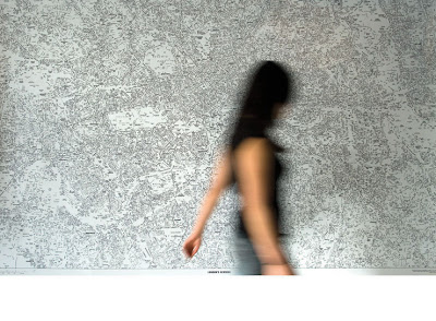
South London Arteries


By British artist Susan Stockwell, 2002

Map Circle


Constructions with map pieces, by Chris Kenny, 2007

Thursday, January 17, 2008

Adventures in Map Making

Maps convey information and tell stories. They invite discovery, exploration and surprise. And they provide a method to navigate your way through unfamiliar territories. Creative problem solving can be a voyage into the unknown where you travel without a map in uncharted waters. And beginning any new artistic endeavor is not without risk, as you venture off this grid to test the waters, but the rewards can be great. Making maps of these new territories are their own best adventures. Bon Voyage!

“A road map always tells you everything except how to refold it”.
- Anonymous

Typewriter Map Symbols

Manhattan Neighborhood Map

London Calling


London's Kerning poster designed for the ISTD exhibition "My London/My City" by NB:Studio in London.

Paris Map


Map by artist Juliette Borda.

You Are Here


This letterpress-printed map published by artist Julie Chen of Flying Fish Press in California, unfolds in a circular manner as if it were a trail you might be following. It is enclosed in a self-contained box with a plexiglas lid and a small toy compass embedded.